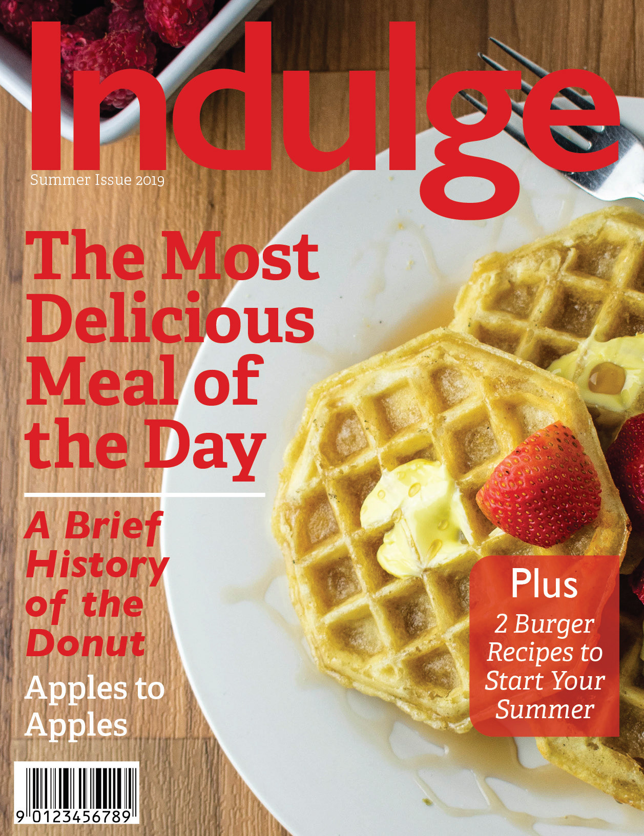
For this piece I was tasked with creating a 26 page magazine. I chose to do food because a subject matter like this was far outside from the normal subjects I tend to work with. This piece contains multiple spreads, some just 2 page spreads, and a couple 4 page spreads. I created this magazine using all original photography that I took myself. I even created a couple of mock ads for the magazine to make it feel real. The colors for the magazine, as well as the logo, were all taken from the imagery. I chose to use a mixture of Sans Serif and Serif fonts to create more dynamic typography between the headlines and the body copy, while the title typography is representative of the feeling of the article. All of the articles were found online and the original writers were all credited within the magazine.